BRIEF & CONCEPT
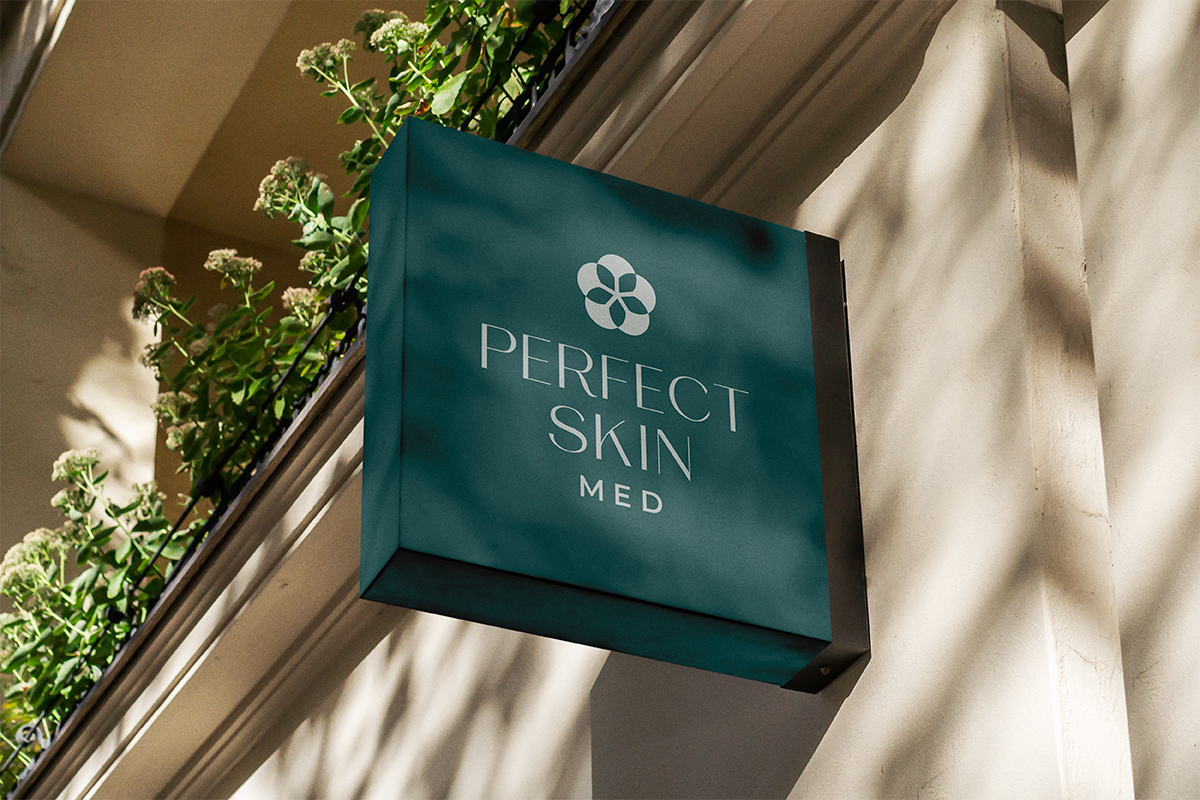
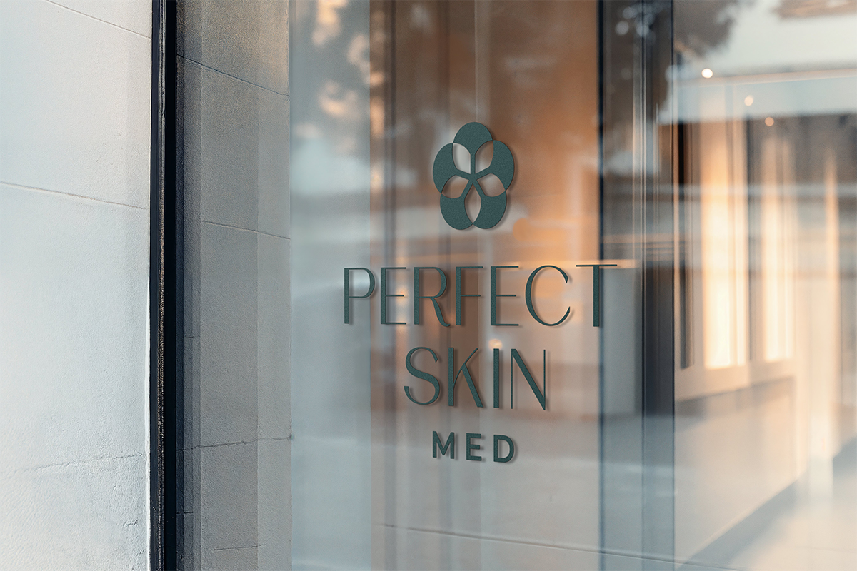
Perfect Skin Med is a premium dermatological skincare brand and clinic. The goal was to execute a comprehensive rebranding that bridges clinical medical expertise with sensory, high-end spa aesthetic. The new identity needed to convey purity, botanical balance, and quiet luxury across digital, packaging, and physical clinic touchpoints.
CREATIVE PROCESS
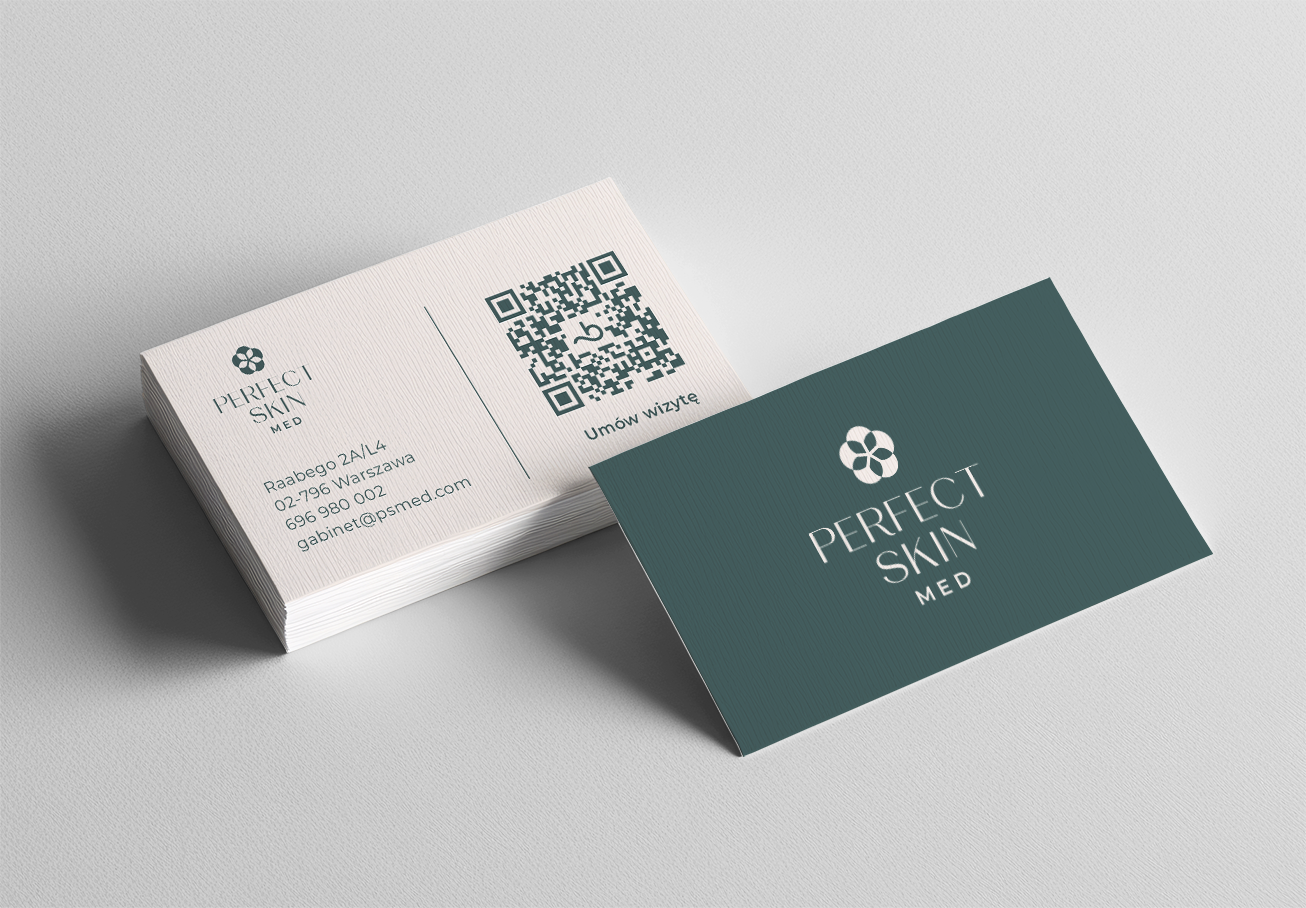
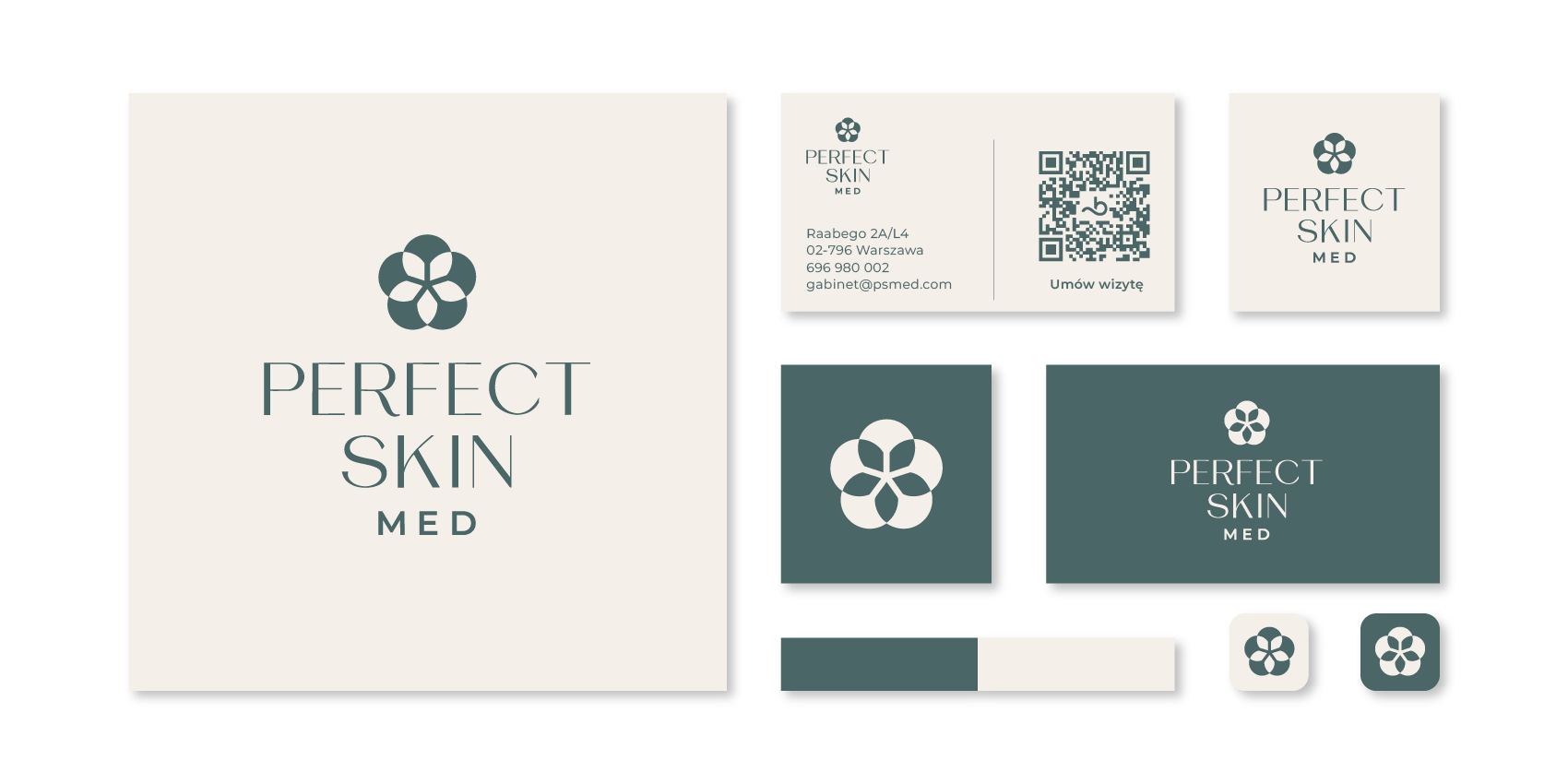
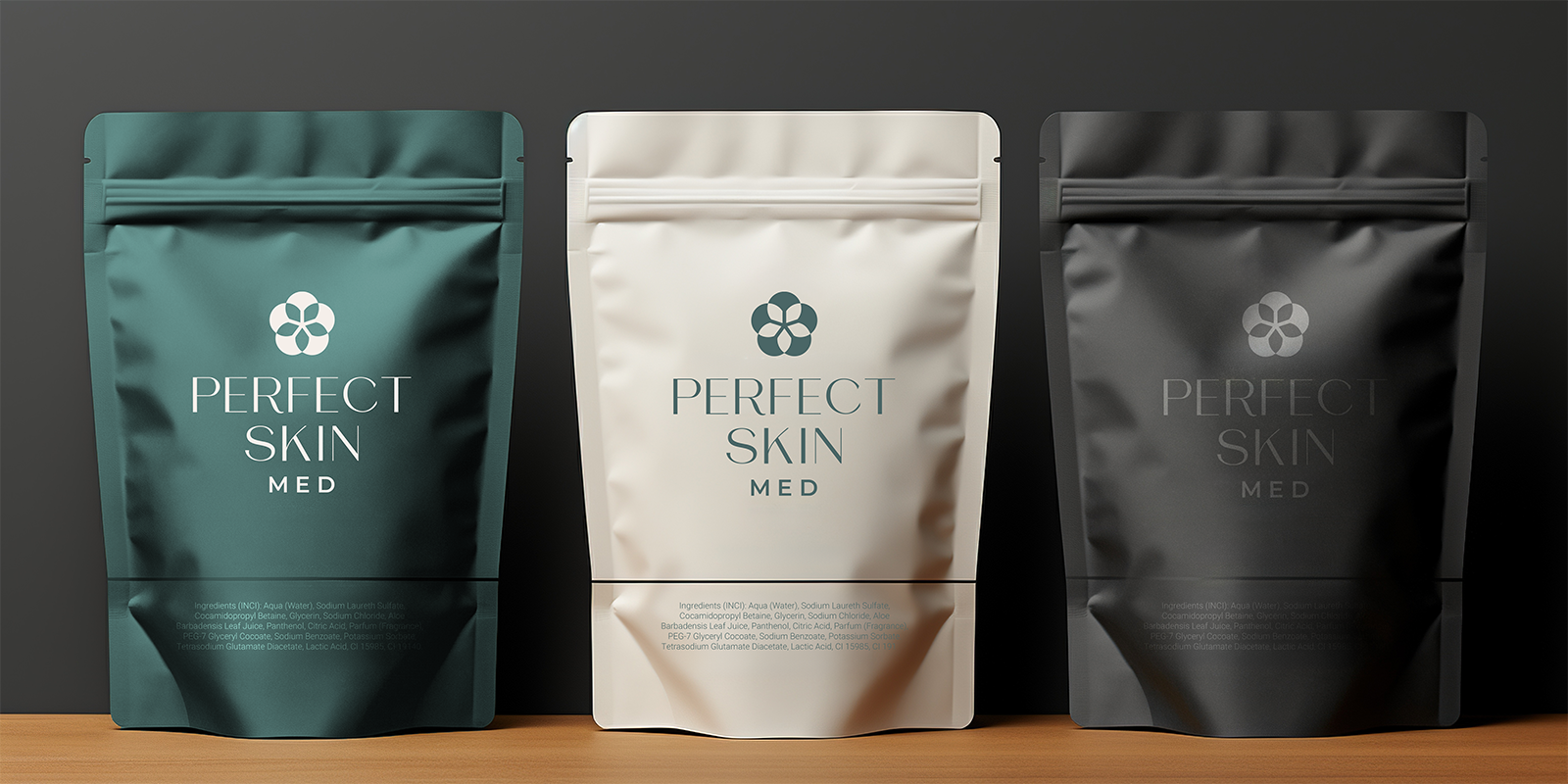
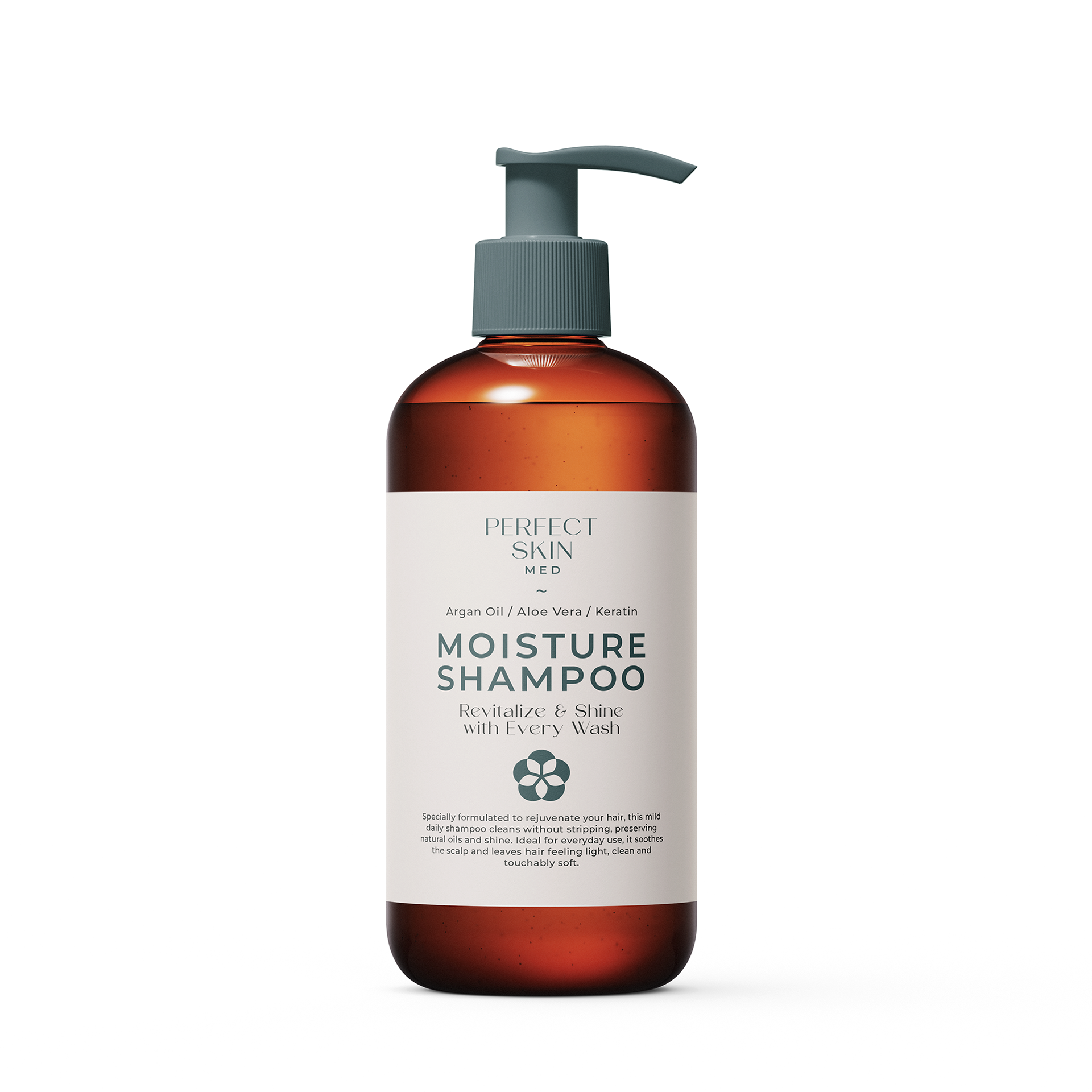
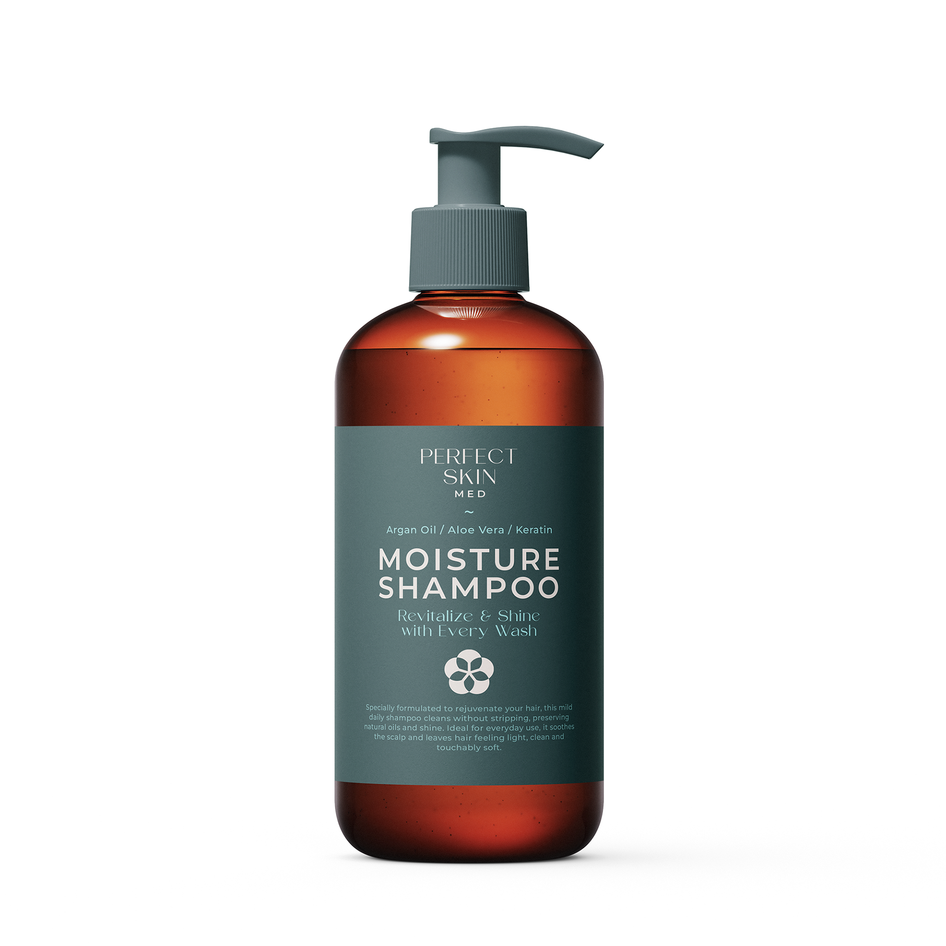
The identity centers around a geometric organic emblem—a five-petal floral star composed of overlapping circles representing cellular renewal, botanical synergy, and precision. Paired with refined high-contrast serif typography and a calm color system (Deep Slate Teal, Warm Off-White Chalk, and Charcoal), the visual balance feels both clinical and luxurious.
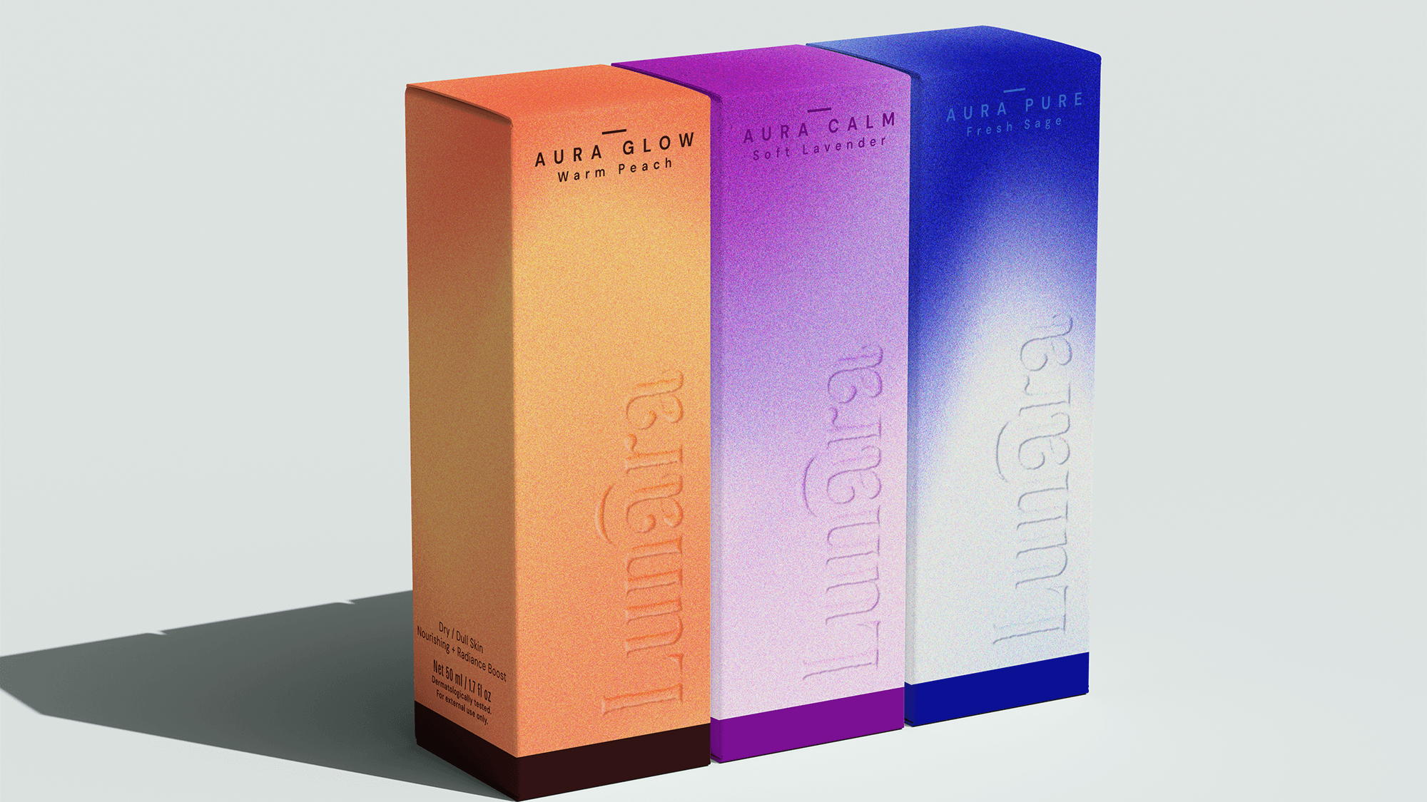
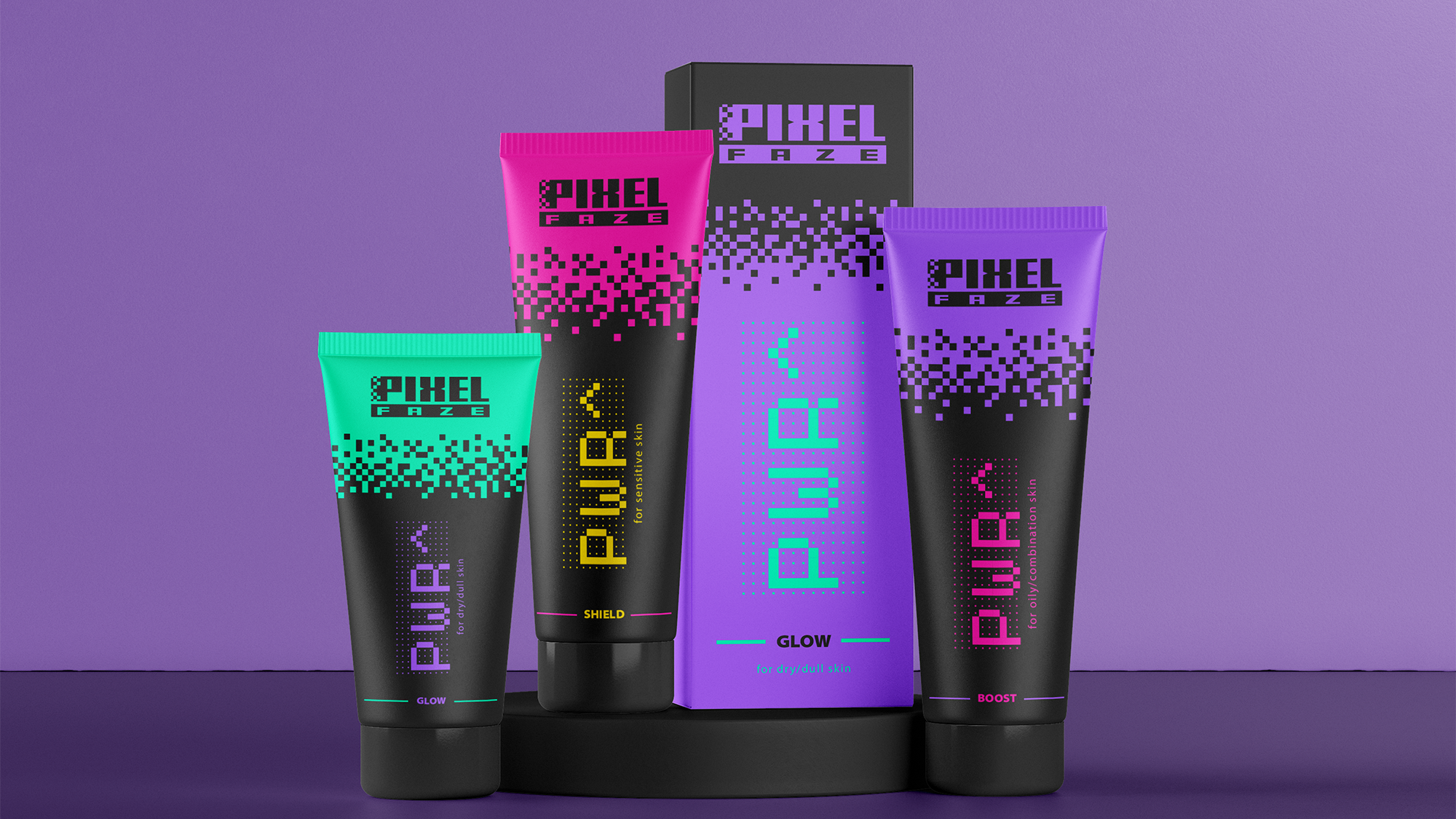
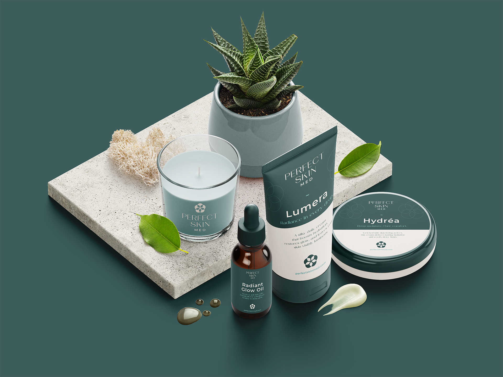
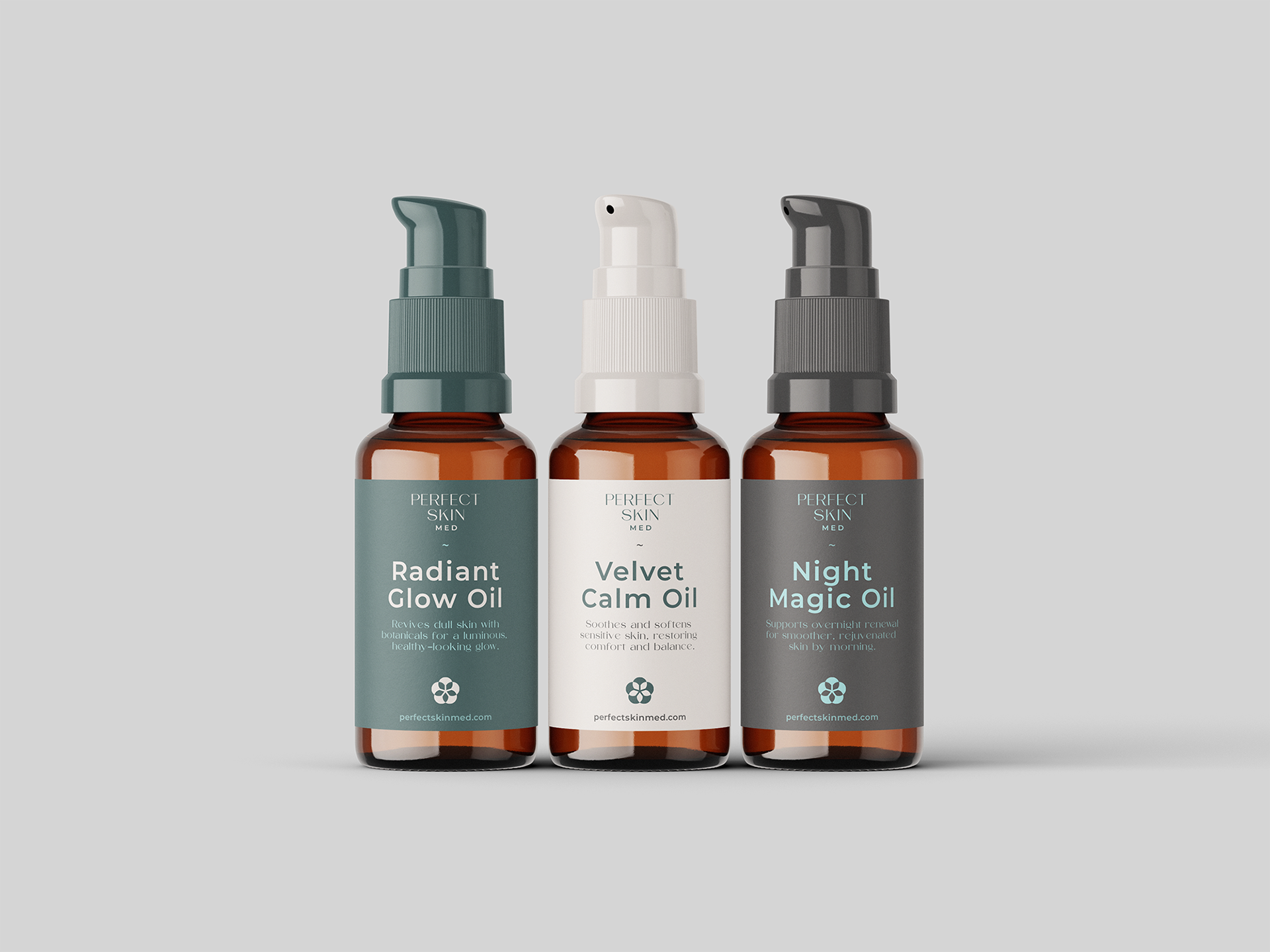
The packaging line spans amber glass dropper bottles, eco-friendly refill pouches, soft-touch tubes, and interior spa accessories (custom candles and interior spatial graphics).
THE RESULT
A holistic brand ecosystem that elevates Perfect Skin Med from a local clinic into an aspirational, luxury skincare destination.