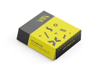
Brief
PIXELFAZE is an original brand concept entirely of my own creation, born from extensive research into the cosmetics market. While exploring emerging skincare trends, I realised there was nothing truly dedicated to the teenage community of computer-game enthusiasts. Seeing this gap, I decided to take the opportunity and visualise a brand that doesn’t yet exist — making the project unique, forward-thinking, and exceptionally positioned.
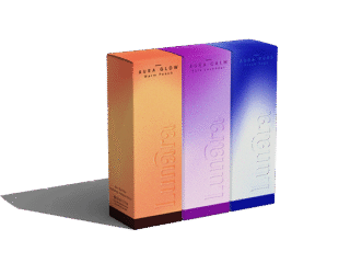
Designed as a retro-game-inspired skincare brand for teens, PIXELFAZE brings together pixel art, vintage game typography, and the playful energy of early home-computer graphics. The brief was to develop a complete brand identity and packaging system for a launch line of three products that function like “power-ups” within a game of skincare.
Process
The visual language draws directly from 1980s arcade aesthetics: a bold, blocky pixelated logotype, neon gradients, glitch transitions, and colourful game-console accents. Typography references bitmap and 8×8 grid fonts — the essential building blocks of early game UI.
For the launch series, PIXELFAZE POWER-UP, I designed three product variants, each with its own accent colour and pixel-icon representing classic game mechanics such as boost, shield, or glow. These elements establish a cohesive “gaming kit” while allowing each product to express its own personality.
The branding process encompassed logotype creation, colour and grid system development, iconography, packaging design, and a unified retro-digital visual language crafted to speak directly to teenage gamers.
Result
The outcome is an expressive and playful brand identity that reframes skincare as part of gameplay. PIXELFAZE stands out as a confidently digital, retro-inspired concept that turns daily routines into fun, game-like interactions. By addressing an underserved teen audience with a distinct visual world, the project demonstrates how brand storytelling and design innovation can bring a completely new category to life — even before it exists in the market.